
Work
About

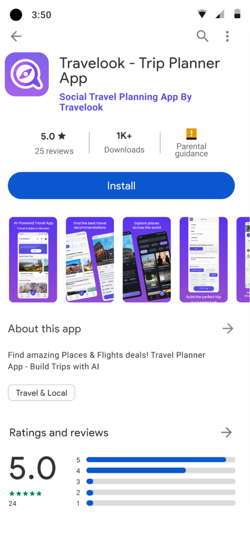
Artificial Intelligence Powered Travel App
Artificial Intelligence Powered Travel App
Helping you plan your dream trip without the stress.
60% more created and shared trips
27% more user retentiondo.
Android
IOS


What we had
Users were struggling to create and shared successful trips, our retention rate is low. So what can we do to improve this?
Discovery Phase
To better understand the problem space, I started with:
- Competitor Analysis: Benchmarked apps like Google Maps, Farmey, Wanderlog, and TripIt to identify gaps and best practices.
- User Research: Conducted interviews and surveys to learn how people plan and share their trips.
- Card Sorting: Helped define the information architecture based on user mental models.
Key Insight
Users were excited about planning trips but often gave up midway due to complexity and lack of guidance.
Our priority
Instant Drop-Off: Losing Users on the Sign-Up Screen
Users leave before even trying. Analytics show a steep 83 % drop-off on the registration screen. New visitors stop at the “Create account”, close the app — just immediate drop-off.
Why it happens?
- Sign-up wall amplifies doubts – Being asked for personal data when the product’s purpose is still fuzzy reinforces abandonment. Value is hidden.
- Form fatigue: the absence of social-login shortcuts and the barely visible error messages add unnecessary friction.
- No brand guidelines – Makes the app look like a different (and less trustworthy) product than the one advertised.
Simplify the process and reducing noice.
Our principal feature was not clear to our users, the users weren’t completing creating trip plans.
We are giving too many unnecessary options, confusing paths and irrelevant information while failing to give feedback on important screens.
This problem caused frequent interruptions, causing users to give up on what we thought should be a straightforward process
We need to focus on providing more intuitive processes that align with our customers' goals and creating a great experience that is engaging and fulfilling.
Unify the visual design.
The current interface mixes typography, color palettes, and component styles, so each screen feels like it belongs to a different product. This inconsistency creates cognitive noise, erodes trust, and lengthens the learning curve.
What we need to do to standardize the look & feel
- Establish a comprehensive design system—palette, type scale, iconography, spacing rules, and interactive components—applied end-to-end.
- Introduce shared design tokens to serve as a single source of truth across all platforms.
- Publish clear usage guidelines (states, error handling, motion patterns, do’s & don’ts) so every team can deliver coherent interfaces.
What is the company's vision?
Incorporate Artificial Intelligence
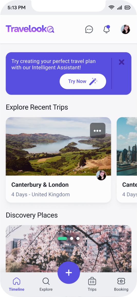
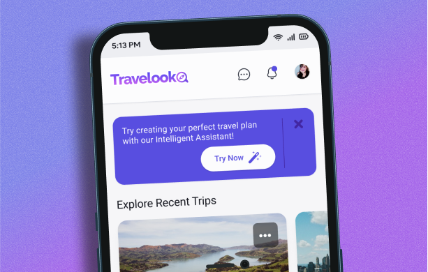
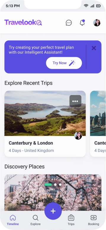
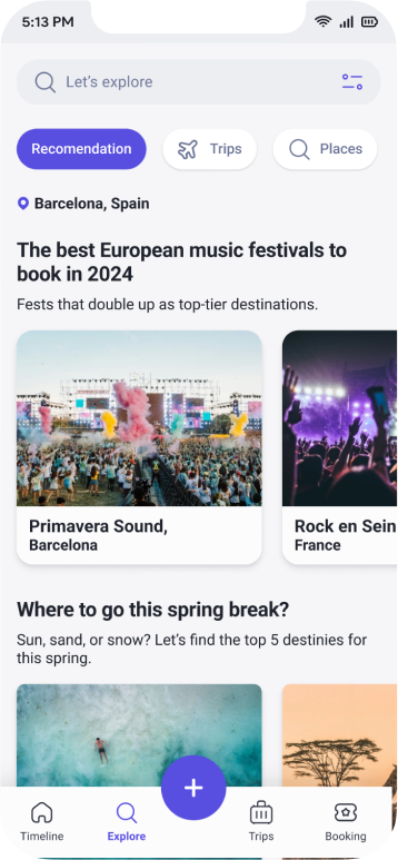
Our goal is to enhance the user experience by swiftly delivering precise content. Recognizing the potential value, we decided to integrate A.I. into the travel planning phase, a decision detailed in this case study.
By incorporating AI into the travel planning phase, we aim to provide users with quicker and more accurate information. With this, we wanted to enhance user satisfaction, which also reflects our commitment to leveraging innovative technologies to streamline processes. Ultimately, the integration of AI in travel planning contributes to our broader vision of creating a cutting-edge and customer-centric service.
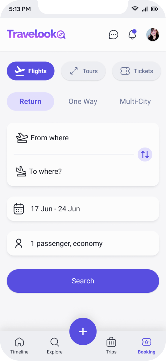
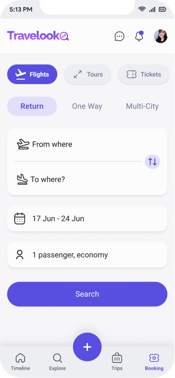
Provide booking & shopping
Our goal is to enhance the user experience by swiftly delivering precise content. Recognizing the potential value, we decided to integrate A.I. into the travel planning phase, a decision detailed in this case study.
With our sales partners integrated into travel planning, users can buy tickets and book hotels right as they plan their trip. It's all about giving users a simpler and more convenient experience, which aligns with our overall company goals.
Design Process
I followed an iterative and user-centered design process:
- User Flows: Designed streamlined flows for creating, editing, and sharing trips.
- Wireframes: Built low-fidelity prototypes to test structure and usability.
- High-Fidelity UI: Developed a modern and friendly interface aligned with Travelook’s branding.
- Prototyping & Testing: Conducted usability tests to validate decisions and refine the design.
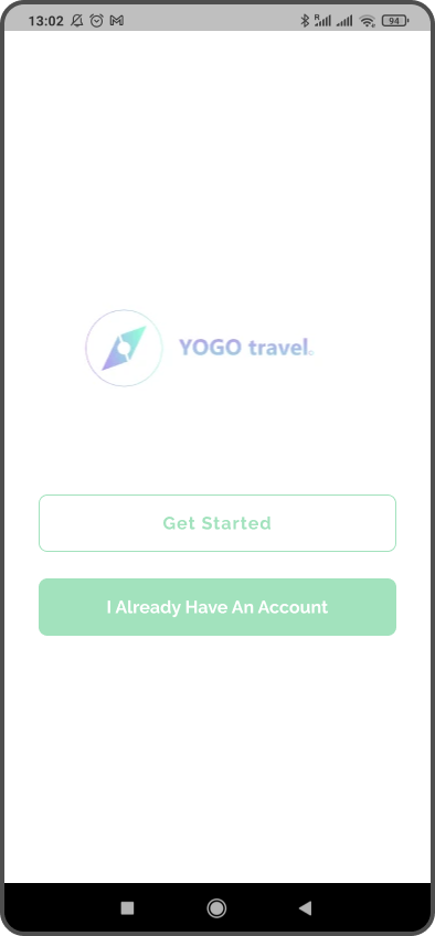
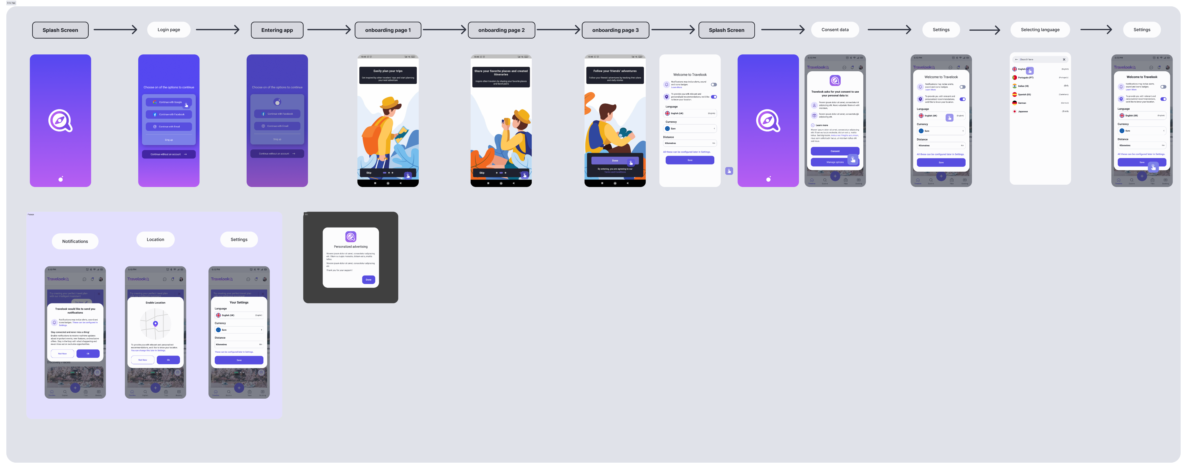
User Login
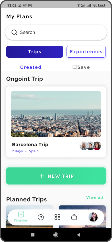
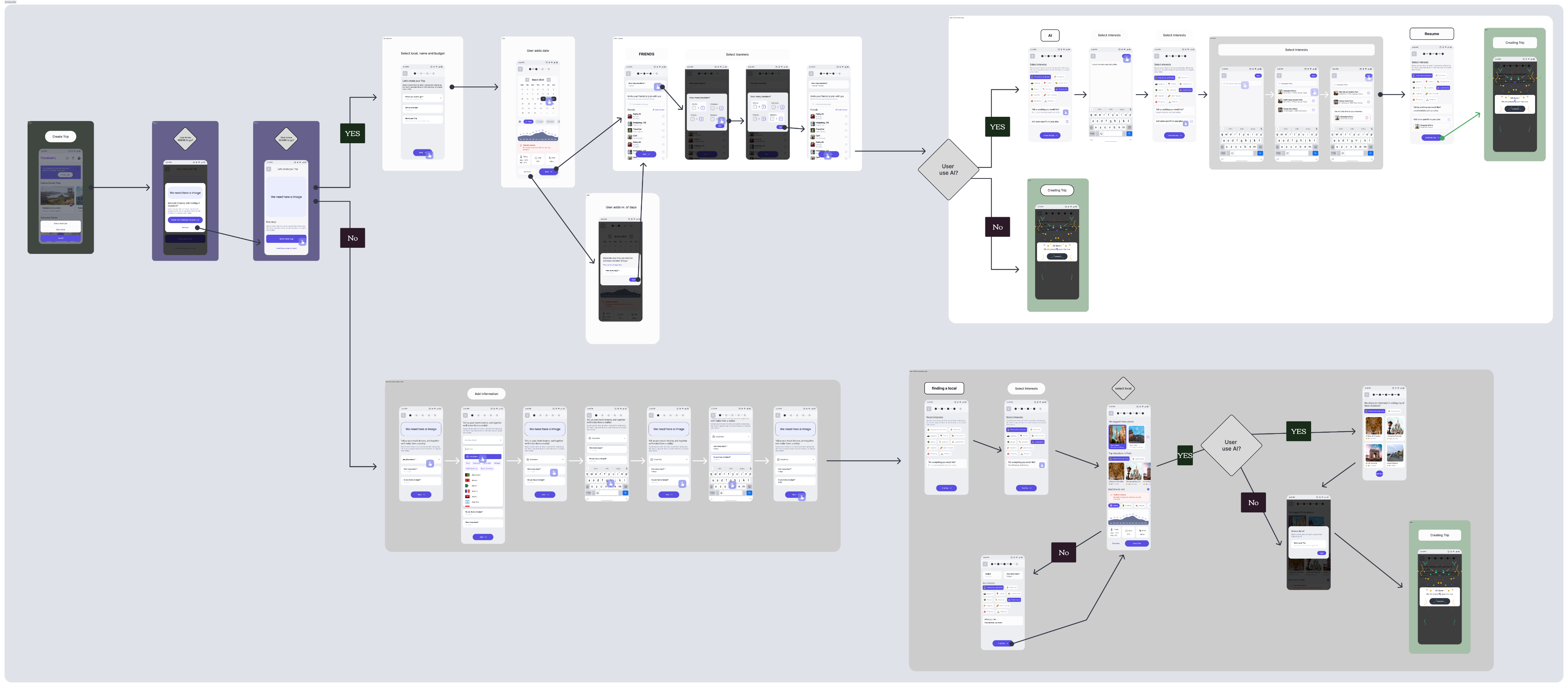
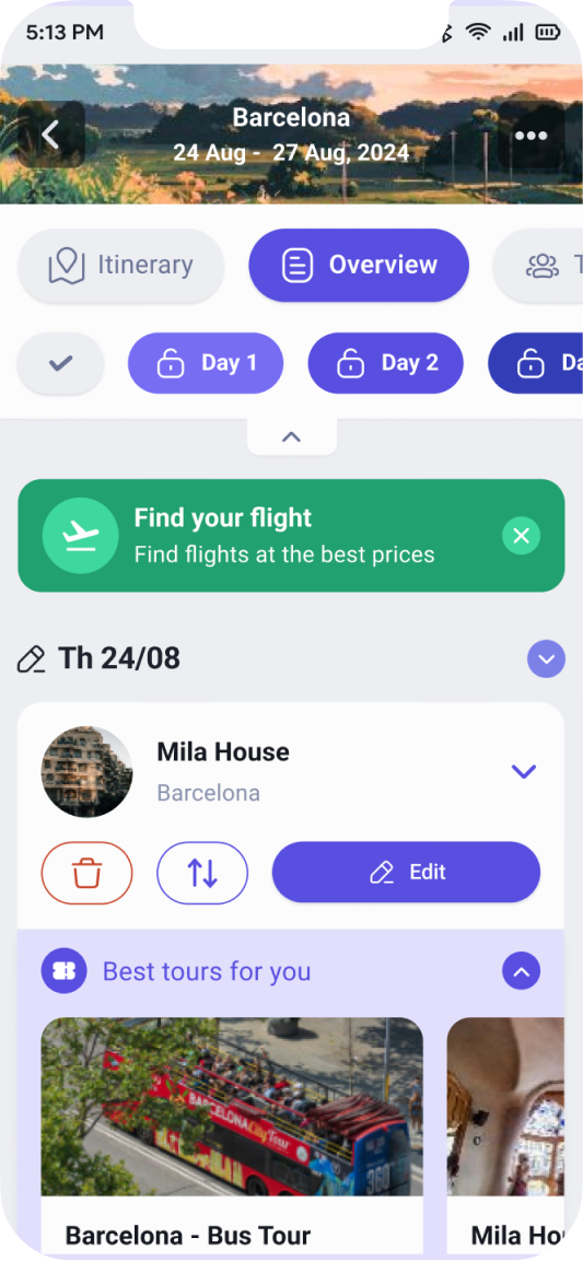
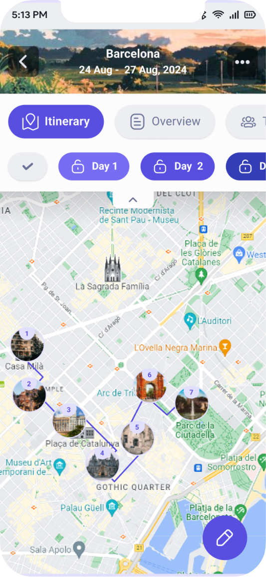
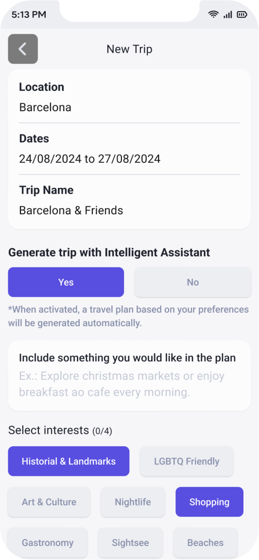
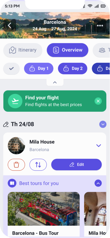
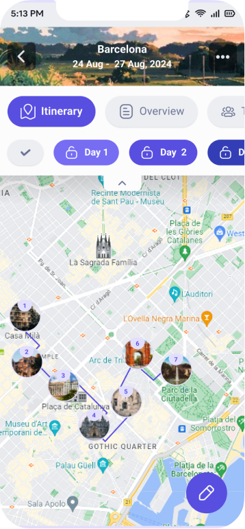
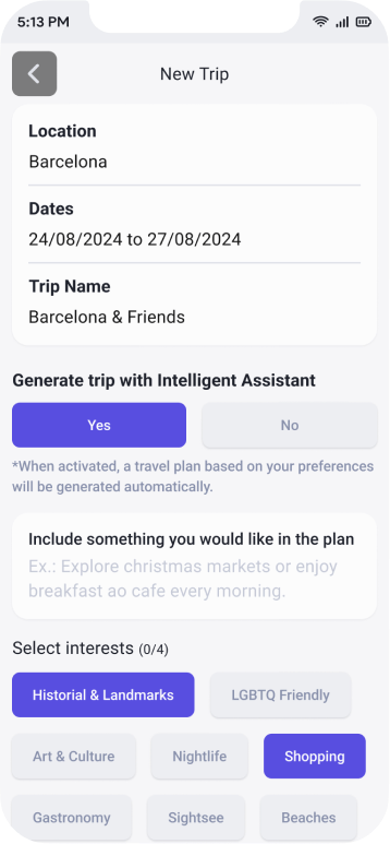
Trip Creation Flow


Results
+60% increase in trips created and shared
+27% increase in user retention
These improvements were observed over a 3-month period after implementing the new design.
Android
IOS


© Patricia Almeida 2022 All Rights Reserved
Patricia Almeida
Work
About

Artificial Intelligence Powered Travel App
Artificial Intelligence Powered Travel App
Helping you plan your dream trip without the stress.
60% more created and shared trips
27% more user retentiondo.
Android
IOS


What we had
Users were struggling to create and shared successful trips, our retention rate is low. So what can we do to improve this?
Discovery Phase
To better understand the problem space, I started with:
- Competitor Analysis: Benchmarked apps like Google Maps, Farmey, Wanderlog, and TripIt to identify gaps and best practices.
- User Research: Conducted interviews and surveys to learn how people plan and share their trips.
- Card Sorting: Helped define the information architecture based on user mental models.
Key Insight
Users were excited about planning trips but often gave up midway due to complexity and lack of guidance.
Our priority
Instant Drop-Off: Losing Users on the Sign-Up Screen
Users leave before even trying. Analytics show a steep 83 % drop-off on the registration screen. New visitors stop at the “Create account”, close the app — just immediate drop-off.
Why it happens?
- Sign-up wall amplifies doubts – Being asked for personal data when the product’s purpose is still fuzzy reinforces abandonment. Value is hidden.
- Form fatigue: the absence of social-login shortcuts and the barely visible error messages add unnecessary friction.
- No brand guidelines – Makes the app look like a different (and less trustworthy) product than the one advertised.
Simplify the process and reducing noice.
Our principal feature was not clear to our users, the users weren’t completing creating trip plans.
We are giving too many unnecessary options, confusing paths and irrelevant information while failing to give feedback on important screens.
This problem caused frequent interruptions, causing users to give up on what we thought should be a straightforward process
We need to focus on providing more intuitive processes that align with our customers' goals and creating a great experience that is engaging and fulfilling.
Unify the visual design.
The current interface mixes typography, color palettes, and component styles, so each screen feels like it belongs to a different product. This inconsistency creates cognitive noise, erodes trust, and lengthens the learning curve.
What we need to do to standardize the look & feel
- Establish a comprehensive design system—palette, type scale, iconography, spacing rules, and interactive components—applied end-to-end.
- Introduce shared design tokens to serve as a single source of truth across all platforms.
- Publish clear usage guidelines (states, error handling, motion patterns, do’s & don’ts) so every team can deliver coherent interfaces.
What is the company's vision?
Incorporate Artificial Intelligence
Our goal is to enhance the user experience by swiftly delivering precise content. Recognizing the potential value, we decided to integrate A.I. into the travel planning phase, a decision detailed in this case study.
By incorporating AI into the travel planning phase, we aim to provide users with quicker and more accurate information. With this, we wanted to enhance user satisfaction, which also reflects our commitment to leveraging innovative technologies to streamline processes. Ultimately, the integration of AI in travel planning contributes to our broader vision of creating a cutting-edge and customer-centric service.
Provide booking & shopping
Our goal is to enhance the user experience by swiftly delivering precise content. Recognizing the potential value, we decided to integrate A.I. into the travel planning phase, a decision detailed in this case study.
With our sales partners integrated into travel planning, users can buy tickets and book hotels right as they plan their trip. It's all about giving users a simpler and more convenient experience, which aligns with our overall company goals.
Design Process
I followed an iterative and user-centered design process:
- User Flows: Designed streamlined flows for creating, editing, and sharing trips.
- Wireframes: Built low-fidelity prototypes to test structure and usability.
- High-Fidelity UI: Developed a modern and friendly interface aligned with Travelook’s branding.
- Prototyping & Testing: Conducted usability tests to validate decisions and refine the design.
User Login
Trip Creation Flow


Results
+60% increase in trips created and shared
+27% increase in user retention
These improvements were observed over a 3-month period after implementing the new design.
Android
IOS
© Patricia Almeida 2022 All Rights Reserved
Patricia Almeida
Work
About

Artificial Intelligence Powered Travel App
Artificial Intelligence Powered Travel App
Helping you plan your dream trip without the stress.
60% more created and shared trips
27% more user retentiondo.
Android
IOS

What we had
Users were struggling to create and shared successful trips, our retention rate is low. So what can we do to improve this?
Discovery Phase
To better understand the problem space, I started with:
- Competitor Analysis: Benchmarked apps like Google Maps, Farmey, Wanderlog, and TripIt to identify gaps and best practices.
- User Research: Conducted interviews and surveys to learn how people plan and share their trips.
- Card Sorting: Helped define the information architecture based on user mental models.
Key Insight
Users were excited about planning trips but often gave up midway due to complexity and lack of guidance.
Our priority
Instant Drop-Off: Losing Users on the Sign-Up Screen
Users leave before even trying. Analytics show a steep 83 % drop-off on the registration screen. New visitors stop at the “Create account”, close the app — just immediate drop-off.
Why it happens?
- Sign-up wall amplifies doubts – Being asked for personal data when the product’s purpose is still fuzzy reinforces abandonment. Value is hidden.
- Form fatigue: the absence of social-login shortcuts and the barely visible error messages add unnecessary friction.
- No brand guidelines – Makes the app look like a different (and less trustworthy) product than the one advertised.
Simplify the process and reducing noice.
Our principal feature was not clear to our users, the users weren’t completing creating trip plans.
We are giving too many unnecessary options, confusing paths and irrelevant information while failing to give feedback on important screens.
This problem caused frequent interruptions, causing users to give up on what we thought should be a straightforward process
We need to focus on providing more intuitive processes that align with our customers' goals and creating a great experience that is engaging and fulfilling.
Unify the visual design.
The current interface mixes typography, color palettes, and component styles, so each screen feels like it belongs to a different product. This inconsistency creates cognitive noise, erodes trust, and lengthens the learning curve.
What we need to do to standardize the look & feel
- Establish a comprehensive design system—palette, type scale, iconography, spacing rules, and interactive components—applied end-to-end.
- Introduce shared design tokens to serve as a single source of truth across all platforms.
- Publish clear usage guidelines (states, error handling, motion patterns, do’s & don’ts) so every team can deliver coherent interfaces.
What is the company's vision?
Incorporate Artificial Intelligence
Our goal is to enhance the user experience by swiftly delivering precise content. Recognizing the potential value, we decided to integrate A.I. into the travel planning phase, a decision detailed in this case study.
By incorporating AI into the travel planning phase, we aim to provide users with quicker and more accurate information. With this, we wanted to enhance user satisfaction, which also reflects our commitment to leveraging innovative technologies to streamline processes. Ultimately, the integration of AI in travel planning contributes to our broader vision of creating a cutting-edge and customer-centric service.
Provide booking & shopping
Our goal is to enhance the user experience by swiftly delivering precise content. Recognizing the potential value, we decided to integrate A.I. into the travel planning phase, a decision detailed in this case study.
With our sales partners integrated into travel planning, users can buy tickets and book hotels right as they plan their trip. It's all about giving users a simpler and more convenient experience, which aligns with our overall company goals.
Design Process
I followed an iterative and user-centered design process:
- User Flows: Designed streamlined flows for creating, editing, and sharing trips.
- Wireframes: Built low-fidelity prototypes to test structure and usability.
- High-Fidelity UI: Developed a modern and friendly interface aligned with Travelook’s branding.
- Prototyping & Testing: Conducted usability tests to validate decisions and refine the design.
User Login
Trip Creation Flow


Results
+60% increase in trips created and shared
+27% increase in user retention
These improvements were observed over a 3-month period after implementing the new design.
Android
IOS
© Patricia Almeida 2022 All Rights Reserved